ShopDreamUp AI ArtDreamUp
Deviation Actions


Suggested Deviants


Suggested Collections


You Might Like…


Featured in Groups

Description
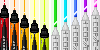
I did this piece of my OC, Hana, like...hmmm...many months ago. I kept working on it and adding to it in an attempt to practice backgrounds. So, I put a flower under her (since her name means "flower"), and a stone arch way around her. (it was meant to frame her...but I know it's off center...)
There were many first times in this one, so if they don't look great...I tried? I wanted the stone arch way to look old, so I tried my best to make it seem so with cracks and mold growth (I did look up reference...but not sure if it's quite right).
I hate how the scanner botches the colours! >.< The colour her dress was *supposed* to be was so much more vibrant! Even photoshop couldn't tweak it's original colour glory. And I also realize that her parasol looks...weird. Another shrug and "I tried". (plus I need A LOT more practice at drawing grass)
Well, I hope some of you enjoy this one. All I can see is the glaring mistakes...but somehow I'm still proud of it.
-----
Hana (c) =SpecterQueen
There were many first times in this one, so if they don't look great...I tried? I wanted the stone arch way to look old, so I tried my best to make it seem so with cracks and mold growth (I did look up reference...but not sure if it's quite right).
I hate how the scanner botches the colours! >.< The colour her dress was *supposed* to be was so much more vibrant! Even photoshop couldn't tweak it's original colour glory. And I also realize that her parasol looks...weird. Another shrug and "I tried".
Well, I hope some of you enjoy this one. All I can see is the glaring mistakes...but somehow I'm still proud of it.
-----
Hana (c) =SpecterQueen
Image size
708x950px 766.49 KB
Make
HP
Model
HP psc1600
Date Taken
Apr 5, 2010, 7:12:33 PM
© 2010 - 2024 SpecterQueen
Comments17
Join the community to add your comment. Already a deviant? Log In
coming from someone in the standpoint that is merly and observer I think the mods where probably trying to suggest you used more darker colors to give it more shading and that it might pop out a bit more, cause I do notice there is a lot of muted colors used in these piece
thats not really to say that it looks bad by any means it looks very nice, I think they were just trying to give you constructive criticism to make it look possibly better.
but i do think if that was there goal they might have tried to phrase it in a better way then they had.
thats not really to say that it looks bad by any means it looks very nice, I think they were just trying to give you constructive criticism to make it look possibly better.
but i do think if that was there goal they might have tried to phrase it in a better way then they had.